
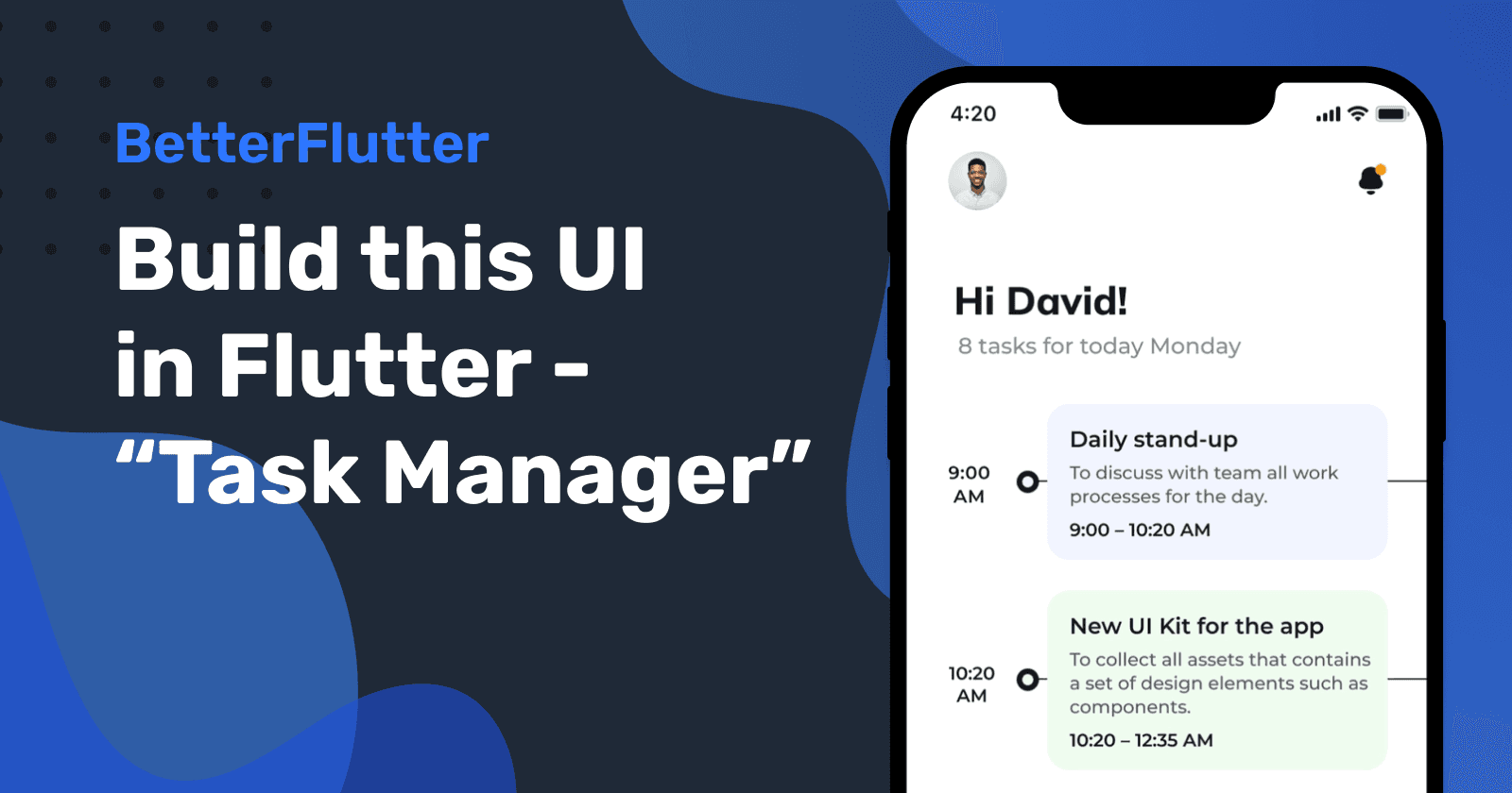
Build this UI in Flutter - Task Manager
In this article, we will recreate an app UI from a dribbble post that caught my eye this week. Check out the project below.
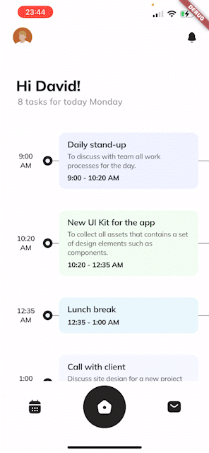
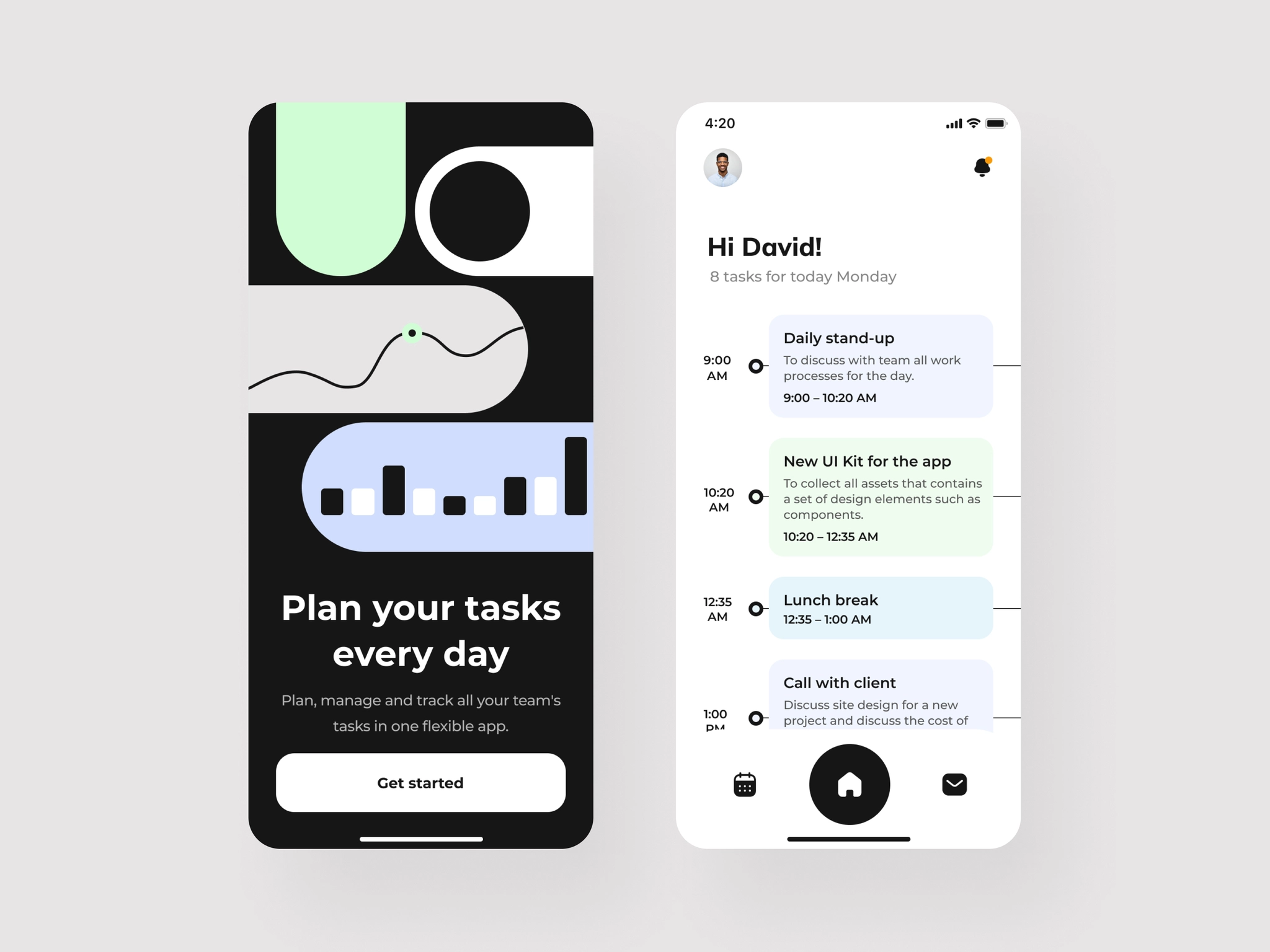 https://dribbble.com/shots/18207094-Task-manager-app
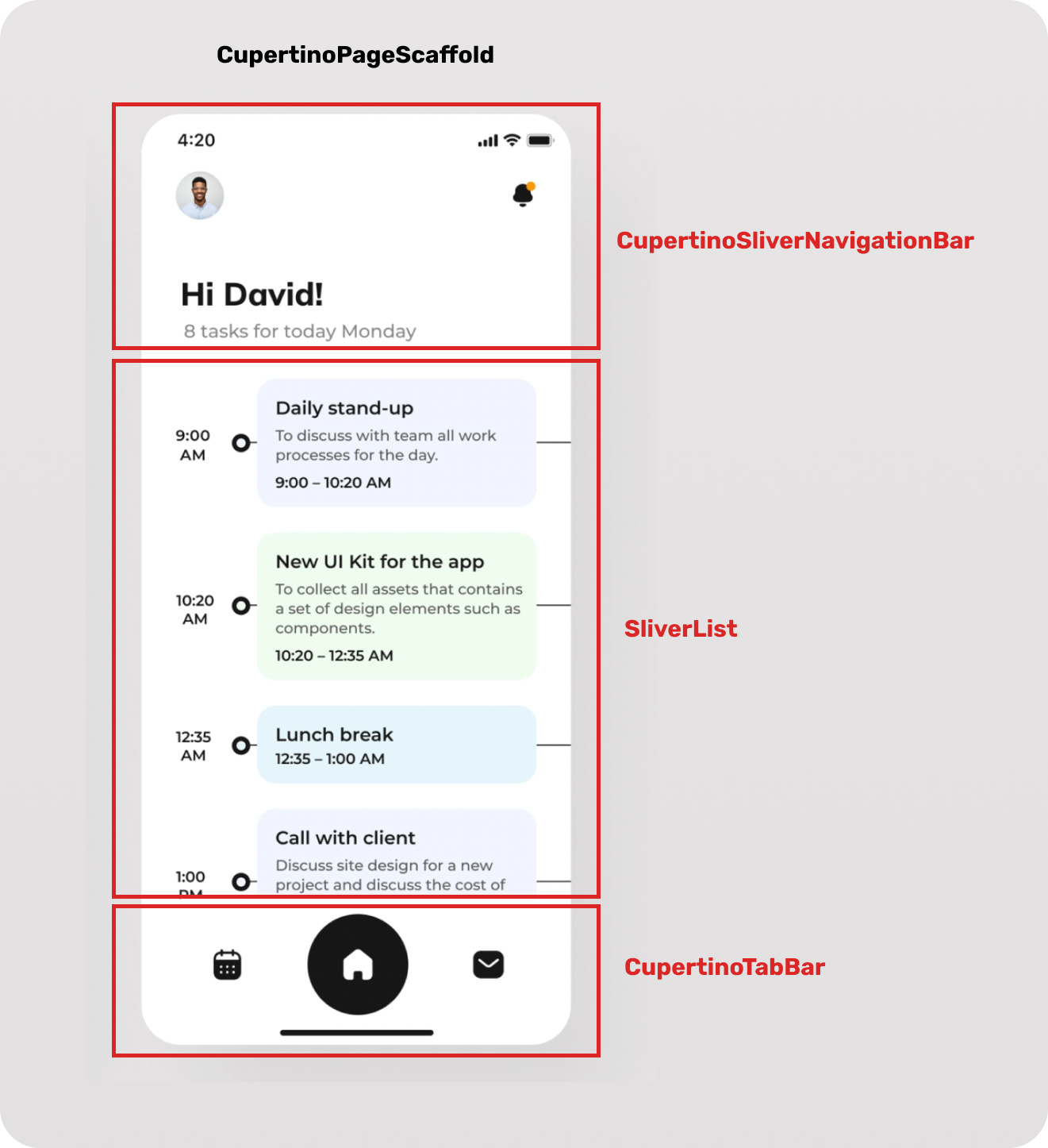
Let me take you through my process of recreating the UI in Flutter. First off I started to lay out the app according to the design. Check out the following images to see how I mapped the Flutter components to the design.
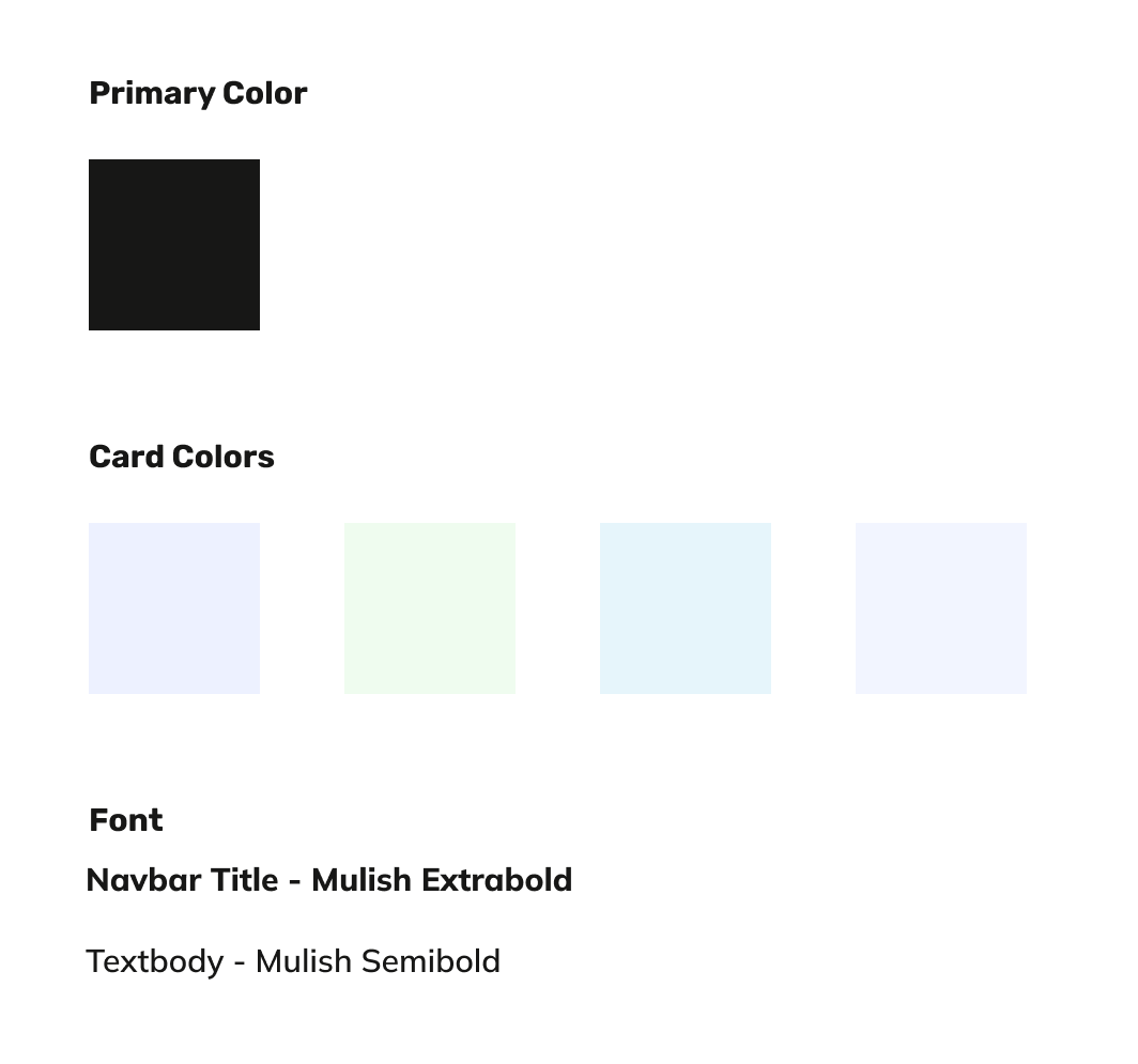
Next, I picked the colors and searched for a Google Font that matched the font that was used in the design. As for the icons I found https://iconsax.io/ which is a great resource for free icons and they look pretty much like the ones in the shot.
Let's get started with coding the app. Create a new Flutter project, then download and add the font in the pubspec.yaml file.
  fonts:
    - family: Mulish
      fonts:
        - asset: fonts/Mulish-Regular.ttf
        - asset: fonts/Mulish-Medium.ttf
          weight: 500
        - asset: fonts/Mulish-Semibold.ttf
          weight: 600
        - asset: fonts/Mulish-Bold.ttf
          weight: 700
        - asset: fonts/Mulish-ExtraBold.ttf
          weight: 800
        - asset: fonts/Mulish-Black.ttf
          weight: 900
Now we can start with creating the first part of the UI. The Bottom Navigation Bar. I used a CupertinoTabBar, but you can as well create the same one with the Material BottomNavigationBar. I just like going for the Cupertino Themes cause they come with some pretty cool effects, like the transparency for the Navigation and Tab Bar, which I'm going to use later.
CupertinoTabBar(
        currentIndex: 1,
        height: 100,
        border: const Border(
            top: BorderSide(width: 0.0, color: CupertinoColors.white)),
        items: <BottomNavigationBarItem>[
          BottomNavigationBarItem(
            icon: Icon(
              Iconsax.calendar5,
              color: CupertinoTheme.of(context).primaryColor,
            ),
            activeIcon: Container(
                padding: const EdgeInsets.all(25),
                decoration: BoxDecoration(
                    color: CupertinoTheme.of(context).primaryColor,
                    borderRadius: BorderRadius.circular(99)),
                child: const Icon(
                  Iconsax.calendar5,
                  color: CupertinoColors.white,
                )),
          )...
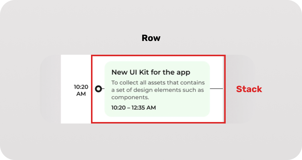
The next Widget we are creating is the Navigation Bar. Here I'm using the one I already created a little Tutorial about that you can read here. It is just a copy the default Apple UI Navbar in Flutter. With the Basic UI ready we can start creating the Task Timeline. As shown in the layout images we are using a SliverList that contains custom ListTiles containing a Stack. Let's have a look at the list tile.
Container(
      padding: const EdgeInsets.only(
        top: 20,
      ),
      child: Row(
        children: [
          Container(
            padding: const EdgeInsets.only(left: 16),
            width: 80,
            child: Text(
              start,
              textAlign: TextAlign.center,
            ),
           //Stack
          ),
        ],
      ),
    );
I needed to give the Container, containing the task time, a fixed Width because I always ran into Layout errors or my multiline Text in the Stack went outside the screen. Stacks don't work with Flexible or Expendable so let me know if you know any way to do it without using fixed Sizes.
With using a fixed width I can now calculate the width of the Stack. For the horizontal line and the dot I just used more Containers and by setting the alignment in the Stack to "centerLeft" we get the layout we wanted to achieve. I also wrapped the description in a Visibility Widget to hide it alongside the space if the task in the list has no description.
 Stack(alignment: Alignment.centerLeft, children: [
            Container(
              width: MediaQuery.of(context).size.width - 80,
              color: CupertinoTheme.of(context).primaryColor,
              height: 1,
            ),
            Container(
              height: 18,
              width: 18,
              decoration: BoxDecoration(
                  color: Color(color),
                  borderRadius: BorderRadius.circular(99),
                  border: Border.all(
                      width: 5,
                      color: CupertinoTheme.of(context).primaryColor)),
            ),
            Container(
                width: MediaQuery.of(context).size.width - 80,
                padding: const EdgeInsets.only(left: 30, right: 20),
                child: Container(
                    decoration: BoxDecoration(
                      color: Color(color),
                      borderRadius: BorderRadius.circular(12),
                    ),
                    padding: const EdgeInsets.symmetric(
                        vertical: 12, horizontal: 16),
                    child: Column(
                        crossAxisAlignment: CrossAxisAlignment.start,
                        children: [
                          Text(
                            title,
                          ),
                          Visibility(
                              visible: description != "",
                              child: Column(children: [
                                const SizedBox(
                                  height: 4,
                                ),
                                Text(
                                    maxLines: 3,
                                    description,
                              ])),
                          const SizedBox(
                            height: 6,
                          ),
                          Text(
                            time,
                        ]))),
          ]),
By putting it all together we achieve a really good-looking result. To get the full code just visit my Github repository. Thanks for reading.